Color color what is it going to be?
I am sure some of you would remember the unique paper game that we used to play as kids. Our life would be pale and boring had it not been for the beauty of them. The business of colors is no child’s play and globally we resort to giants and manufacturers to come up with new and interesting shades every year. Do you know which corporate is officially responsible for setting a trend in them across the world?
Well dear friends its Pantone Inc. a corporation though based in New Jersey has its influence across the world. The company is most popular for its Pantone Matching System (PMS), used in industries like printing. Apart from this, it is also responsible for setting the official shade and other associate shades every year.
For the year 2014, Radiant orchid is chosen as the official shade of the year. Additionally designers here have come up with a list of non-conventional spring shades that will refresh and bring about a sense of charm for spring revelers. Let us have a look at what they are.
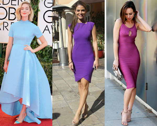
Placid Blue is inspired by a cloudless sky, and gives a reassuring and tranquil sense of peaceful calmness on people. Our recommendation will be to wear a scarf or a Stoll, as that would really compliment your look.
Peppered with a bit of purple royalty violet tulip brings about a taste of nostalgia and romance on wearers. Inspired from the ornamental green of summers, the hemlock color provides a decorative touch that is indeed refreshing after a long and hasty winter.
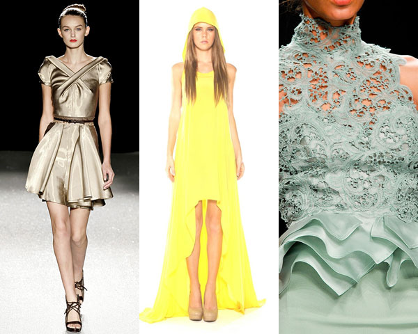 Layering yourself with a mixture of high-pitched Cayenne & Freesia colors is bound get everyone’s attention on you. Dazzling Blue is considered the polar opposite of Placid Blue and pairs well with mixtures of apparels.
On a concluding note, hope you have enjoyed reading our article. In addition to the themes discussed above, if you have a combination of your own do let us know.
Layering yourself with a mixture of high-pitched Cayenne & Freesia colors is bound get everyone’s attention on you. Dazzling Blue is considered the polar opposite of Placid Blue and pairs well with mixtures of apparels.
On a concluding note, hope you have enjoyed reading our article. In addition to the themes discussed above, if you have a combination of your own do let us know.